ant design vue组件用法
栅格Grid
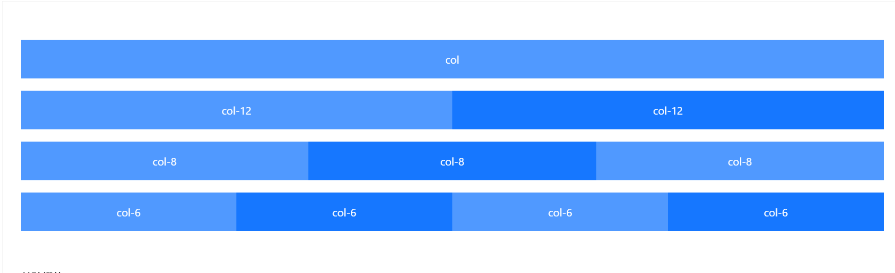
基础栅格
从堆叠到水平排列。
使用单一的一组 Row 和 Col 栅格组件,就可以创建一个基本的栅格系统,所有列(Col)必须放在 Row 内。
<template>
  <a-row>
    <a-col :span="24">col</a-col>
  </a-row>
  <a-row>
    <a-col :span="12">col-12</a-col>
    <a-col :span="12">col-12</a-col>
  </a-row>
  <a-row>
    <a-col :span="8">col-8</a-col>
    <a-col :span="8">col-8</a-col>
    <a-col :span="8">col-8</a-col>
  </a-row>
  <a-row>
    <a-col :span="6">col-6</a-col>
    <a-col :span="6">col-6</a-col>
    <a-col :span="6">col-6</a-col>
    <a-col :span="6">col-6</a-col>
  </a-row>
</template>
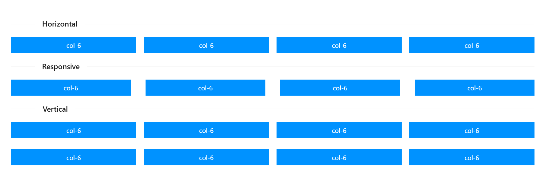
区块间隔
栅格常常需要和间隔进行配合,你可以使用 Row 的 gutter 属性,我们推荐使用 (16+8n)px 作为栅格间隔(n 是自然数)。
如果要支持响应式,可以写成 { xs: 8, sm: 16, md: 24, lg: 32 }。
如果需要垂直间距,可以写成数组形式 [水平间距, 垂直间距] [16, { xs: 8, sm: 16, md: 24, lg: 32 }]。
数组形式垂直间距在
1.5.0之后支持。
<template>
  <a-divider orientation="left">Horizontal</a-divider>
  <a-row :gutter="16">
    <a-col class="gutter-row" :span="6">
      <div class="gutter-box">col-6</div>
    </a-col>
    <a-col class="gutter-row" :span="6">
      <div class="gutter-box">col-6</div>
    </a-col>
    <a-col class="gutter-row" :span="6">
      <div class="gutter-box">col-6</div>
    </a-col>
    <a-col class="gutter-row" :span="6">
      <div class="gutter-box">col-6</div>
    </a-col>
  </a-row>
  <a-divider orientation="left">Responsive</a-divider>
  <a-row :gutter="{ xs: 8, sm: 16, md: 24, lg: 32 }">
    <a-col class="gutter-row" :span="6">
      <div class="gutter-box">col-6</div>
    </a-col>
    <a-col class="gutter-row" :span="6">
      <div class="gutter-box">col-6</div>
    </a-col>
    <a-col class="gutter-row" :span="6">
      <div class="gutter-box">col-6</div>
    </a-col>
    <a-col class="gutter-row" :span="6">
      <div class="gutter-box">col-6</div>
    </a-col>
  </a-row>
  <a-divider orientation="left">Vertical</a-divider>
  <a-row :gutter="[16, 24]">
    <a-col class="gutter-row" :span="6">
      <div class="gutter-box">col-6</div>
    </a-col>
    <a-col class="gutter-row" :span="6">
      <div class="gutter-box">col-6</div>
    </a-col>
    <a-col class="gutter-row" :span="6">
      <div class="gutter-box">col-6</div>
    </a-col>
    <a-col class="gutter-row" :span="6">
      <div class="gutter-box">col-6</div>
    </a-col>
    <a-col class="gutter-row" :span="6">
      <div class="gutter-box">col-6</div>
    </a-col>
    <a-col class="gutter-row" :span="6">
      <div class="gutter-box">col-6</div>
    </a-col>
    <a-col class="gutter-row" :span="6">
      <div class="gutter-box">col-6</div>
    </a-col>
    <a-col class="gutter-row" :span="6">
      <div class="gutter-box">col-6</div>
    </a-col>
  </a-row>
</template>

<style scoped>
.gutter-box {
  background: #0092ff;
  padding: 8px 0;
}
</style>
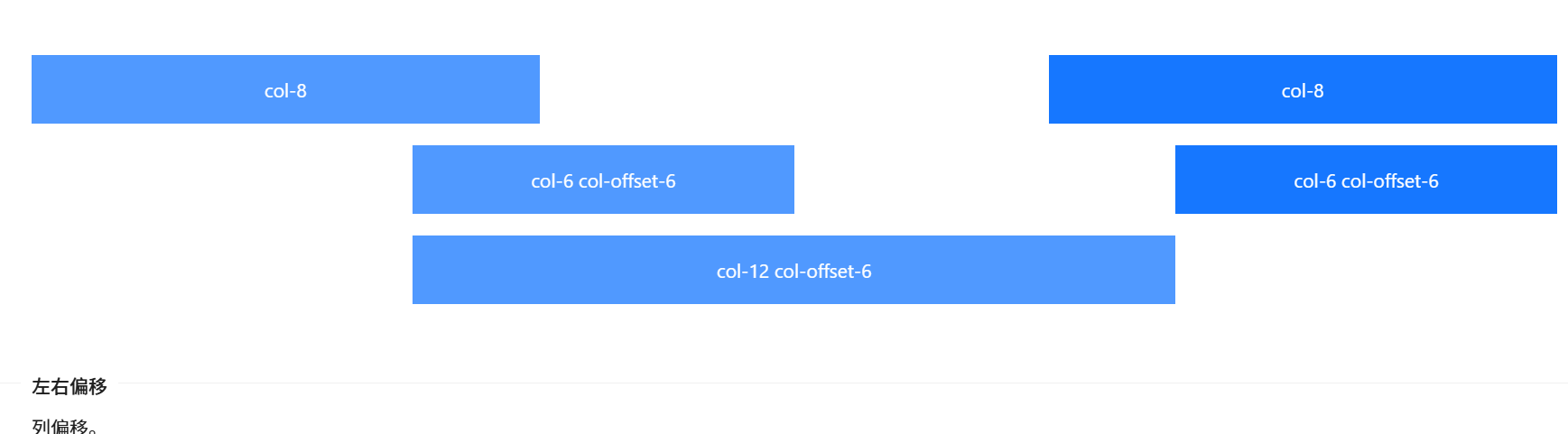
左右偏移
列偏移。
使用 offset 可以将列向右侧偏。例如,offset={4} 将元素向右侧偏移了 4 个列(column)的宽度。
<template>
  <a-row>
    <a-col :span="8">col-8</a-col>
    <a-col :span="8" :offset="8">col-8</a-col>
  </a-row>
  <a-row>
    <a-col :span="6" :offset="6">col-6 col-offset-6</a-col>
    <a-col :span="6" :offset="6">col-6 col-offset-6</a-col>
  </a-row>
  <a-row>
    <a-col :span="12" :offset="6">col-12 col-offset-6</a-col>
  </a-row>
</template>
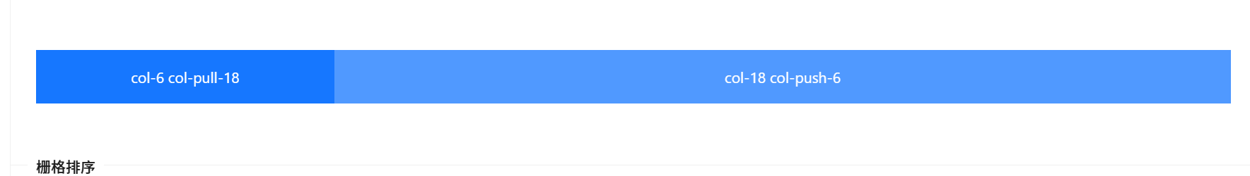
栅格排序
列排序。
通过使用 push 和 pull 类就可以很容易的改变列(column)的顺序。
<template>
  <a-row>
    <a-col :span="18" :push="6">col-18 col-push-6</a-col>
    <a-col :span="6" :pull="18">col-6 col-pull-18</a-col>
  </a-row>
</template>
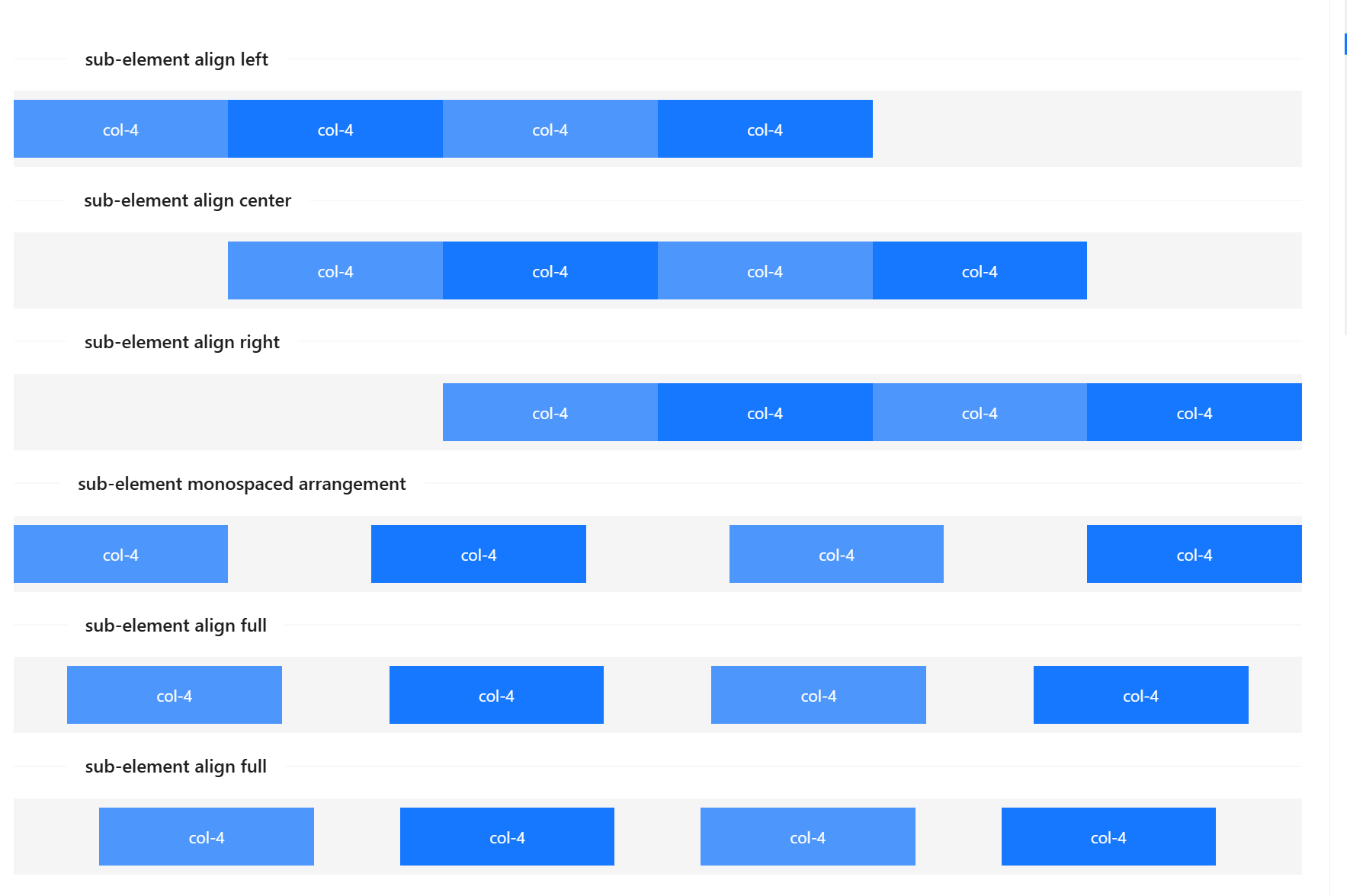
排版
布局基础。
子元素根据不同的值 start,center,end,space-between,space-around,分别定义其在父节点里面的排版方式。
<template>
  <div id="components-grid-demo-flex">
    <a-divider orientation="left">sub-element align left</a-divider>
    <a-row justify="start">
      <a-col :span="4">col-4</a-col>
      <a-col :span="4">col-4</a-col>
      <a-col :span="4">col-4</a-col>
      <a-col :span="4">col-4</a-col>
    </a-row>

    <a-divider orientation="left">sub-element align center</a-divider>
    <a-row justify="center">
      <a-col :span="4">col-4</a-col>
      <a-col :span="4">col-4</a-col>
      <a-col :span="4">col-4</a-col>
      <a-col :span="4">col-4</a-col>
    </a-row>

    <a-divider orientation="left">sub-element align right</a-divider>
    <a-row justify="end">
      <a-col :span="4">col-4</a-col>
      <a-col :span="4">col-4</a-col>
      <a-col :span="4">col-4</a-col>
      <a-col :span="4">col-4</a-col>
    </a-row>

    <a-divider orientation="left">sub-element monospaced arrangement</a-divider>
    <a-row justify="space-between">
      <a-col :span="4">col-4</a-col>
      <a-col :span="4">col-4</a-col>
      <a-col :span="4">col-4</a-col>
      <a-col :span="4">col-4</a-col>
    </a-row>

    <a-divider orientation="left">sub-element align full</a-divider>
    <a-row justify="space-around">
      <a-col :span="4">col-4</a-col>
      <a-col :span="4">col-4</a-col>
      <a-col :span="4">col-4</a-col>
      <a-col :span="4">col-4</a-col>
    </a-row>

    <a-divider orientation="left">sub-element align full</a-divider>
    <a-row justify="space-evenly">
      <a-col :span="4">col-4</a-col>
      <a-col :span="4">col-4</a-col>
      <a-col :span="4">col-4</a-col>
      <a-col :span="4">col-4</a-col>
    </a-row>
  </div>
</template>

<style lang="less" scoped>
:deep(#components-grid-demo-flex) [class~='ant-row'] {
  background: rgba(128, 128, 128, 0.08);
}
</style>
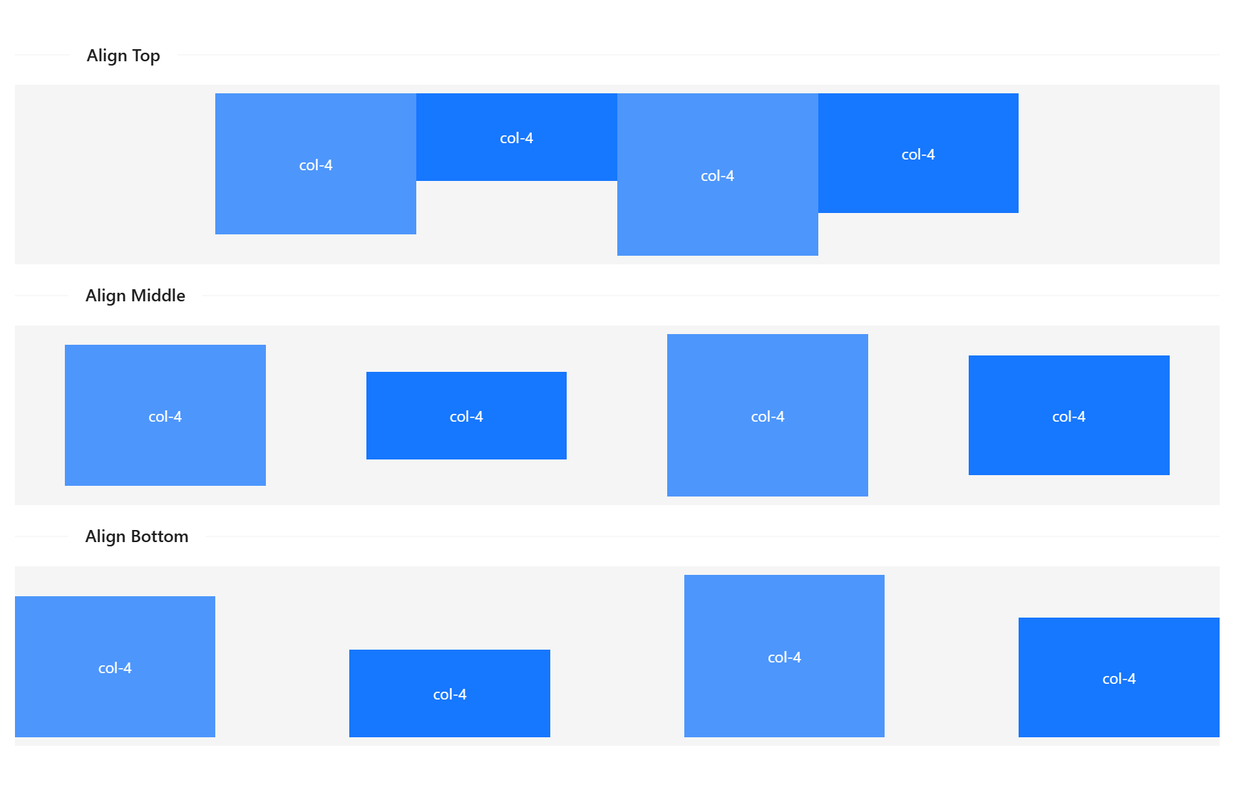
对齐
子元素垂直对齐。
<template>
  <div id="components-grid-demo-flex-align">
    <a-divider orientation="left">Align Top</a-divider>
    <a-row justify="center" align="top">
      <a-col :span="4">
        <p class="height-100">col-4</p>
      </a-col>
      <a-col :span="4">
        <p class="height-50">col-4</p>
      </a-col>
      <a-col :span="4">
        <p class="height-120">col-4</p>
      </a-col>
      <a-col :span="4">
        <p class="height-80">col-4</p>
      </a-col>
    </a-row>

    <a-divider orientation="left">Align Middle</a-divider>
    <a-row justify="space-around" align="middle">
      <a-col :span="4">
        <p class="height-100">col-4</p>
      </a-col>
      <a-col :span="4">
        <p class="height-50">col-4</p>
      </a-col>
      <a-col :span="4">
        <p class="height-120">col-4</p>
      </a-col>
      <a-col :span="4">
        <p class="height-80">col-4</p>
      </a-col>
    </a-row>

    <a-divider orientation="left">Align Bottom</a-divider>
    <a-row justify="space-between" align="bottom">
      <a-col :span="4">
        <p class="height-100">col-4</p>
      </a-col>
      <a-col :span="4">
        <p class="height-50">col-4</p>
      </a-col>
      <a-col :span="4">
        <p class="height-120">col-4</p>
      </a-col>
      <a-col :span="4">
        <p class="height-80">col-4</p>
      </a-col>
    </a-row>
  </div>
</template>

<style lang="less" scoped>
:deep(#components-grid-demo-flex-align) [class~='ant-row'] {
  background: rgba(128, 128, 128, 0.08);
}
</style>
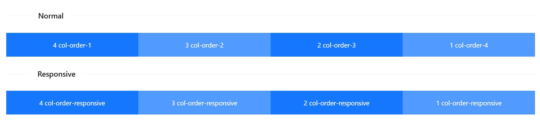
排序
通过 order 来改变元素的排序。
<template>
  <a-divider orientation="left">Normal</a-divider>
  <a-row>
    <a-col :span="6" :order="4">1 col-order-4</a-col>
    <a-col :span="6" :order="3">2 col-order-3</a-col>
    <a-col :span="6" :order="2">3 col-order-2</a-col>
    <a-col :span="6" :order="1">4 col-order-1</a-col>
  </a-row>
  <a-divider orientation="left">Responsive</a-divider>
  <a-row>
    <a-col :span="6" :xs="{ order: 1 }" :sm="{ order: 2 }" :md="{ order: 3 }" :lg="{ order: 4 }">
      1 col-order-responsive
    </a-col>
    <a-col :span="6" :xs="{ order: 2 }" :sm="{ order: 1 }" :md="{ order: 4 }" :lg="{ order: 3 }">
      2 col-order-responsive
    </a-col>
    <a-col :span="6" :xs="{ order: 3 }" :sm="{ order: 4 }" :md="{ order: 2 }" :lg="{ order: 2 }">
      3 col-order-responsive
    </a-col>
    <a-col :span="6" :xs="{ order: 4 }" :sm="{ order: 3 }" :md="{ order: 1 }" :lg="{ order: 1 }">
      4 col-order-responsive
    </a-col>
  </a-row>
</template>
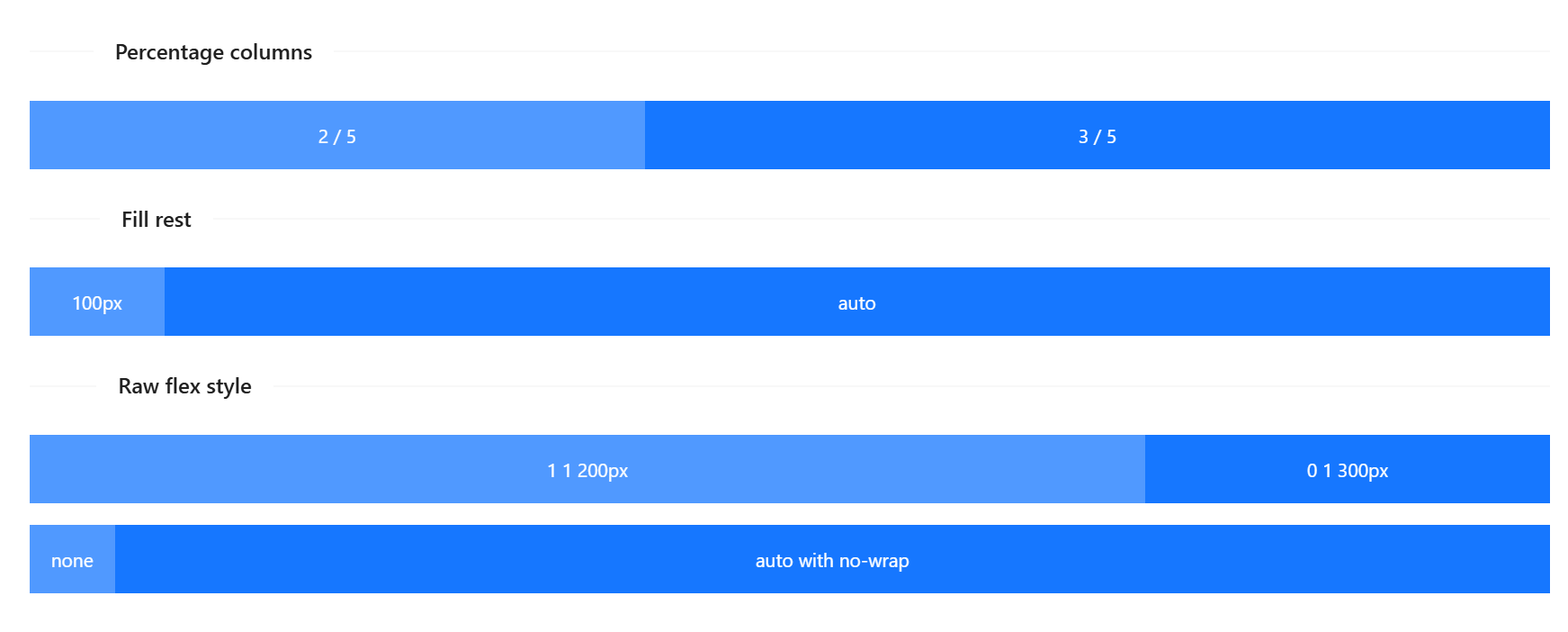
Flex 填充
Col 提供 flex 属性以支持填充。
<template>
  <a-divider orientation="left">Percentage columns</a-divider>
  <a-row>
    <a-col :flex="2">2 / 5</a-col>
    <a-col :flex="3">3 / 5</a-col>
  </a-row>
  <a-divider orientation="left">Fill rest</a-divider>
  <a-row>
    <a-col flex="100px">100px</a-col>
    <a-col flex="auto">auto</a-col>
  </a-row>
  <a-divider orientation="left">Raw flex style</a-divider>
  <a-row>
    <a-col flex="1 1 200px">1 1 200px</a-col>
    <a-col flex="0 1 300px">0 1 300px</a-col>
  </a-row>
  <a-row :wrap="false">
    <a-col flex="none">
      <div style="padding: 0 16px">none</div>
    </a-col>
    <a-col flex="auto">auto with no-wrap</a-col>
  </a-row>
</template>
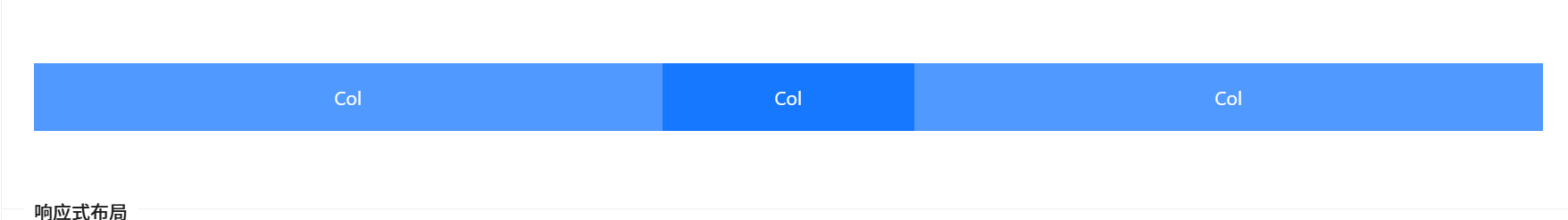
参照 Bootstrap 的 响应式设计,预设六个响应尺寸:xs sm md lg xl xxl。
<template>
  <a-row>
    <a-col :xs="2" :sm="4" :md="6" :lg="8" :xl="10">Col</a-col>
    <a-col :xs="20" :sm="16" :md="12" :lg="8" :xl="4">Col</a-col>
    <a-col :xs="2" :sm="4" :md="6" :lg="8" :xl="10">Col</a-col>
  </a-row>
</template>
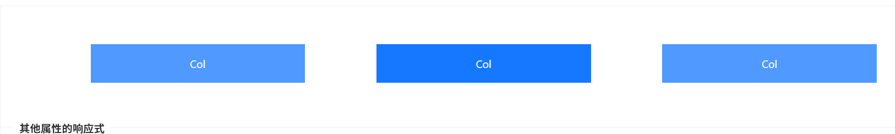
span pull push offset order 属性可以通过内嵌到 xs sm md lg xl xxl 属性中来使用。
其中 :xs="6" 相当于 :xs="{ span: 6 }"。
<template>
  <a-row>
    <a-col :xs="{ span: 5, offset: 1 }" :lg="{ span: 6, offset: 2 }">Col</a-col>
    <a-col :xs="{ span: 11, offset: 1 }" :lg="{ span: 6, offset: 2 }">Col</a-col>
    <a-col :xs="{ span: 5, offset: 1 }" :lg="{ span: 6, offset: 2 }">Col</a-col>
  </a-row>
</template>
ant design vue组件用法
http://localhost:8090//archives/ant-design-vuezu-jian-yong-fa