Ant Design Vue组件使用
介绍
ant-design-vue 为 Web 应用提供了丰富的基础 UI 组件,我们还将持续探索企业级应用的最佳 UI 实践。
组件引入
import { createApp } from 'vue';
import Antd from 'ant - design - vue';
import 'ant - design - vue/dist/antd.css';
import App from './App.vue';

const app = createApp(App);
app.use(Antd);
app.mount('#app');
基础组件
button按钮
不同类型的按钮
<template>
  <a-space wrap>
    <a-button type="primary">Primary Button</a-button>
    <a-button>Default Button</a-button>
    <a-button type="dashed">Dashed Button</a-button>
    <a-button type="text">Text Button</a-button>
    <a-button type="link">Link Button</a-button>
  </a-space>
</template>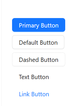
按钮有五种类型:主按钮、次按钮、虚线按钮、文本按钮和链接按钮。主按钮在同一个操作区域最多出现一次。
不可用状态按钮
<template>
  <a-space direction="vertical">
    <a-space>
      <a-button type="primary">Primary</a-button>
      <a-button type="primary" disabled>Primary(disabled)</a-button>
    </a-space>
    <a-space>
      <a-button>Default</a-button>
      <a-button disabled>Default(disabled)</a-button>
    </a-space>
    <a-space>
      <a-button type="dashed">Dashed</a-button>
      <a-button type="dashed" disabled>Dashed(disabled)</a-button>
    </a-space>
    <a-space>
      <a-button type="text">Text</a-button>
      <a-button type="text" disabled>Text(disabled)</a-button>
    </a-space>
    <a-space>
      <a-button type="link">Link</a-button>
      <a-button type="link" disabled>Link(disabled)</a-button>
    </a-space>
    <a-space>
      <a-button danger>Danger Default</a-button>
      <a-button danger disabled>Danger Default(disabled)</a-button>
    </a-space>
    <a-space>
      <a-button danger type="text">Danger Text</a-button>
      <a-button danger type="text" disabled>Danger Text(disabled)</a-button>
    </a-space>
    <a-space>
      <a-button danger type="link">Danger Link</a-button>
      <a-button danger type="link" disabled>Danger Link(disabled)</a-button>
    </a-space>
    <div :style="{ padding: '8px', background: 'rgb(190, 200, 200)' }">
      <a-space>
        <a-button ghost>Ghost</a-button>
        <a-button ghost disabled>Ghost(disabled)</a-button>
      </a-space>
    </div>
  </a-space>
</template>
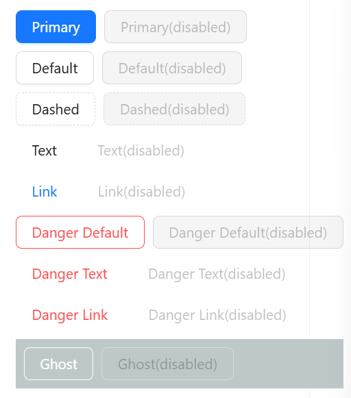
添加 disabled 属性即可让按钮处于不可用状态,同时按钮样式也会改变。
图标按钮
<template>
  <a-space direction="vertical">
    <a-space warp>
      <a-tooltip title="search">
        <a-button type="primary" shape="circle" :icon="h(SearchOutlined)" />
      </a-tooltip>
      <a-button type="primary" shape="circle">A</a-button>
      <a-button type="primary" :icon="h(SearchOutlined)">Search</a-button>
      <a-tooltip title="search">
        <a-button shape="circle" :icon="h(SearchOutlined)" />
      </a-tooltip>
      <a-button :icon="h(SearchOutlined)">Search</a-button>
    </a-space>
    <a-space warp>
      <a-tooltip title="search">
        <a-button shape="circle" :icon="h(SearchOutlined)" />
      </a-tooltip>
      <a-button :icon="h(SearchOutlined)">Search</a-button>
      <a-tooltip title="search">
        <a-button type="dashed" shape="circle" :icon="h(SearchOutlined)" />
      </a-tooltip>
      <a-button type="dashed" :icon="h(SearchOutlined)">Search</a-button>
      <a-button :icon="h(SearchOutlined)" href="https://www.google.com" />
    </a-space>
  </a-space>
</template>
<script lang="ts" setup>
import { h } from 'vue';
import { SearchOutlined } from '@ant-design/icons-vue';
</script>
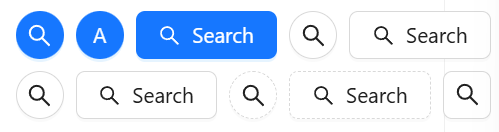
当需要在 Button 内嵌入 Icon 时,可以设置 icon 属性,或者直接在 Button 内使用 Icon 组件。
如果想控制 Icon 具体的位置,只能直接使用 Icon 组件,而非 icon 属性。
按钮尺寸
<template>
  <a-space direction="vertical">
    <a-radio-group v-model:value="size">
      <a-radio-button value="large">Large</a-radio-button>
      <a-radio-button value="default">Default</a-radio-button>
      <a-radio-button value="small">Small</a-radio-button>
    </a-radio-group>
    <a-space>
      <a-button type="primary" :size="size">Primary</a-button>
      <a-button :size="size">Normal</a-button>
      <a-button type="dashed" :size="size">Dashed</a-button>
      <a-button danger :size="size">Danger</a-button>
      <a-button type="link" :size="size">Link</a-button>
    </a-space>
    <a-space>
      <a-button type="primary" :size="size">
        <template #icon>
          <DownloadOutlined />
        </template>
      </a-button>
      <a-button type="primary" shape="circle" :size="size">
        <template #icon>
          <DownloadOutlined />
        </template>
      </a-button>
      <a-button type="primary" shape="round" :size="size">
        <template #icon>
          <DownloadOutlined />
        </template>
        Download
      </a-button>
      <a-button type="primary" shape="round" :size="size">
        <template #icon>
          <DownloadOutlined />
        </template>
      </a-button>
      <a-button type="primary" :size="size">
        <template #icon>
          <DownloadOutlined />
        </template>
        Download
      </a-button>
    </a-space>
  </a-space>
</template>
<script lang="ts" setup>
import { DownloadOutlined } from '@ant-design/icons-vue';
import type { SizeType } from 'ant-design-vue/es/config-provider';
import { ref } from 'vue';
const size = ref<SizeType>('large');
</script>
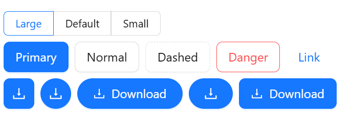
按钮有大、中、小三种尺寸。
通过设置 size 为 large small 分别把按钮设为大、小尺寸。若不设置 size,则尺寸为中。
多种按钮
<template>
  <a-space>
    <a-button type="primary">Primary</a-button>
    <a-button>secondary</a-button>
    <a-dropdown>
      <template #overlay>
        <a-menu @click="handleMenuClick">
          <a-menu-item key="1">1st item</a-menu-item>
          <a-menu-item key="2">2nd item</a-menu-item>
          <a-menu-item key="3">3rd item</a-menu-item>
        </a-menu>
      </template>
      <a-button>
        Actions
        <DownOutlined />
      </a-button>
    </a-dropdown>
  </a-space>
</template>
<script lang="ts" setup>
import { DownOutlined } from '@ant-design/icons-vue';
import type { MenuProps } from 'ant-design-vue';
const handleMenuClick: MenuProps['onClick'] = e => {
  console.log('click', e);
};
</script>
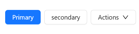
按钮组合使用时,推荐使用 1 个主操作 + n 个次操作,3 个以上操作时把更多操作放到 Dropdown.Button 中组合使用。
不同样式按钮(适应父类宽度)
<template>
  <a-space wrap>
    <a-button type="primary" block>Primary</a-button>
    <a-button block>Default</a-button>
    <a-button type="dashed" block>Dashed</a-button>
    <a-button danger block>Danger</a-button>
    <a-button type="link" block>Link</a-button>
  </a-space>
</template>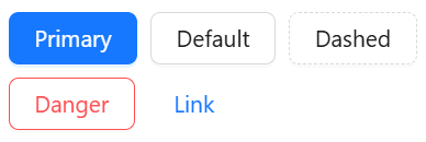
block 属性将使按钮适合其父宽度。
Ant Design Vue组件使用
http://localhost:8090//archives/ant-design-vuezu-jian-shi-yong